Saturday, July 11, 2009
Monday, July 6, 2009
Cowboy head image
This is an image I'll be using and integrating into an upcoming mobile phone app. I'll be tweaking it to work at relatively small screen sizes as well.

Wednesday, May 6, 2009

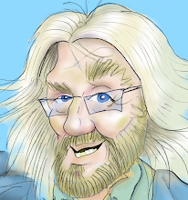
Friday, April 10, 2009
Ron Wood, Bobby Womack from rough to color
Here's the progress from rough sketch to final colored illustration of Ron Wood and Bobby Womack during a fleeting moment during Bobby's induction to the Rock and Roll Hall of Fame.
Final:

Pencil Drawing:

Rough Sketch:

Final:
Pencil Drawing:
Rough Sketch:
Saturday, March 21, 2009
Whiteboard scissors
This was originally drawn on whiteboard, then subtracted out the background and then colorized and made some other treatments in PhotoShop.

Tuesday, March 10, 2009
Sketchbook page
Here's a page out of the sketch book - a quick Sharpie sketch of a goalie and a runner.

Thursday, February 26, 2009
Quick sketch again
Here's a quick sketch of a polo player on horseback. I'm specifically trying to stop once I get the proportions down.

Saturday, February 21, 2009
Quick Sketch of two women holding children
This took about 5 mins, just trying to get the rough proportions down.

Sunday, November 9, 2008

Wednesday, October 8, 2008
Real world bad UI
In the last few weeks, I happened to notice some confusing signage in places I'm at on a regular basis and thought it might make for an amusing blog post. Just like bad UI in a software application, these bits of signage/labels made me stop for a second and scratch my head:

I have a spot on the top floor of a parking garage in downtown Columbus, and all ramps are one-way. Here's the sign showing my way out. I guess they thought an arrow pointing the way out wouldn't give me enough information, so this not-arrow gives me the much more informative message that this is the way to not go for people going the direction I'm not.
Sometimes after a long day, I still have to pause for a millisecond when I see this sign. And this sign is not meant for the other guy, as he would have to have already come up the ramp to see that he shouldn't have.
Here are the elevator buttons I was using daily at the office:

Naturally, to go down, you can see that I pushed the top button.
In their defense, we are on the top floor, so the only way is down. So it looks like they just tried to reuse the same button panel as was on the other floors, only they decided to only mark the exceptional up button as down without marking the down button appropriately. Hope noone forgets they're on the top floor.
Subscribe to:
Posts (Atom)